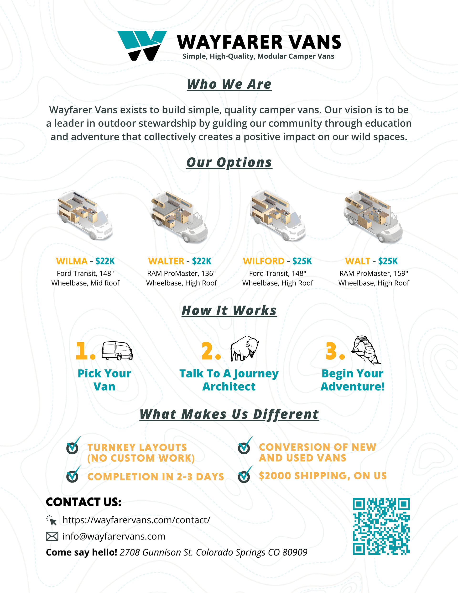
During my time with Mavericks Marketing, I've had the privilege of working with Wayfarer Vans, a pre-fab camper van company out of CO Springs. Wayfarer Vans had an existing brand book with established brand colors, landmark illustrations, and camping supplies icons. I got a feel for their brand personality, values, and goals, and from there, I designed many different assets for them. This included programmatic ads, email templates, downloadable guides, event banners, flyers, and more.
Below are some of the materials I designed for Wayfarer Vans.
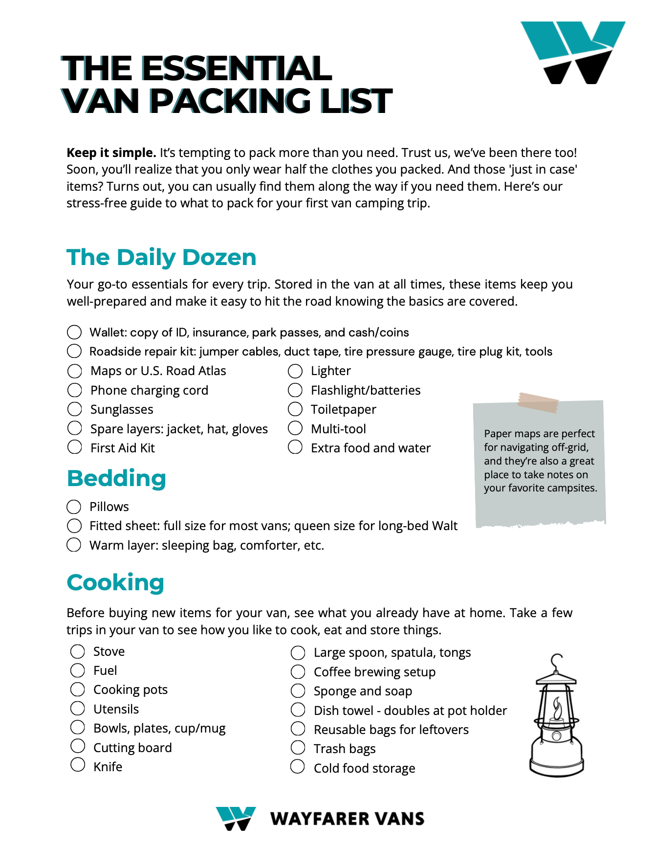
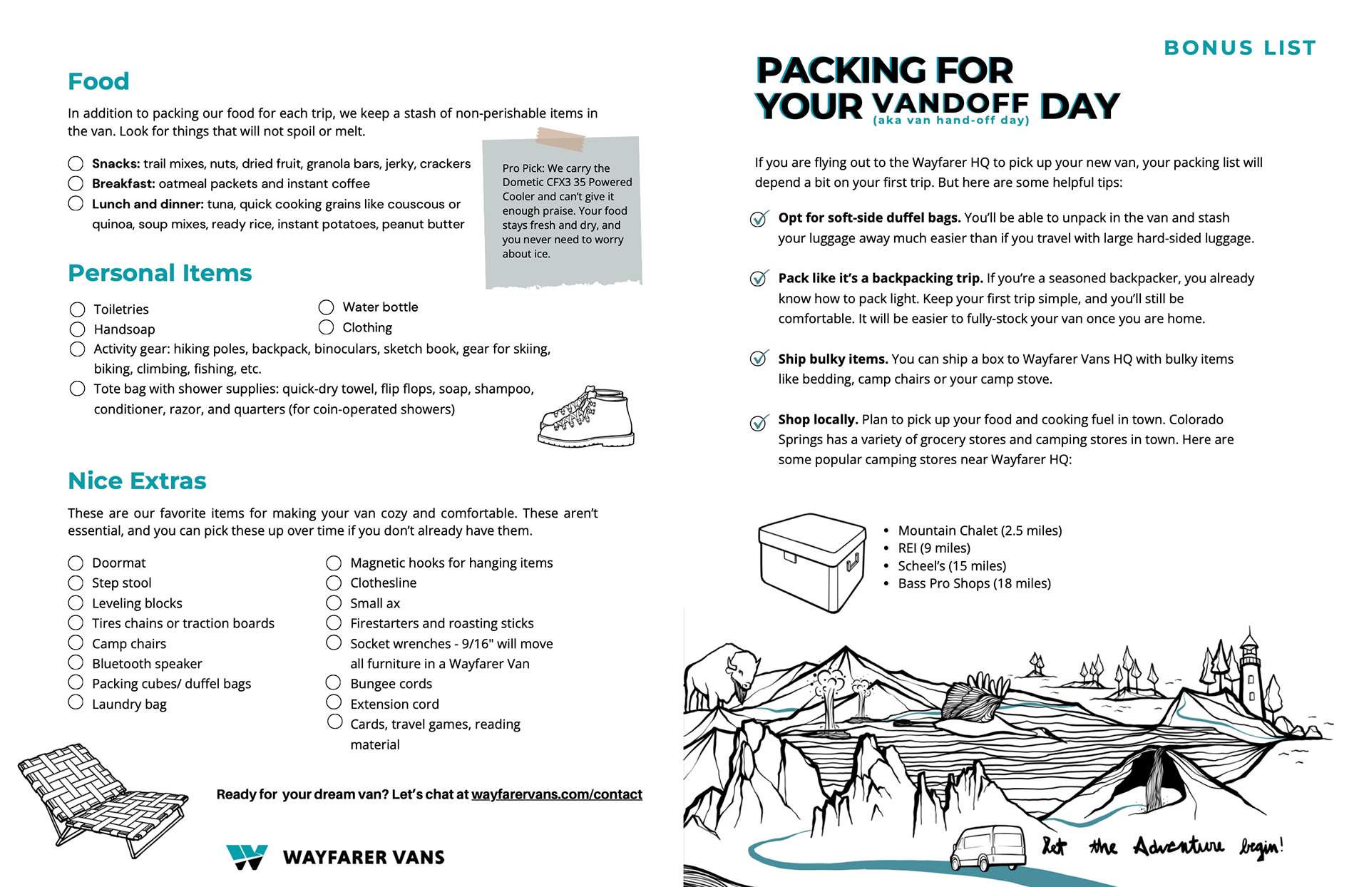
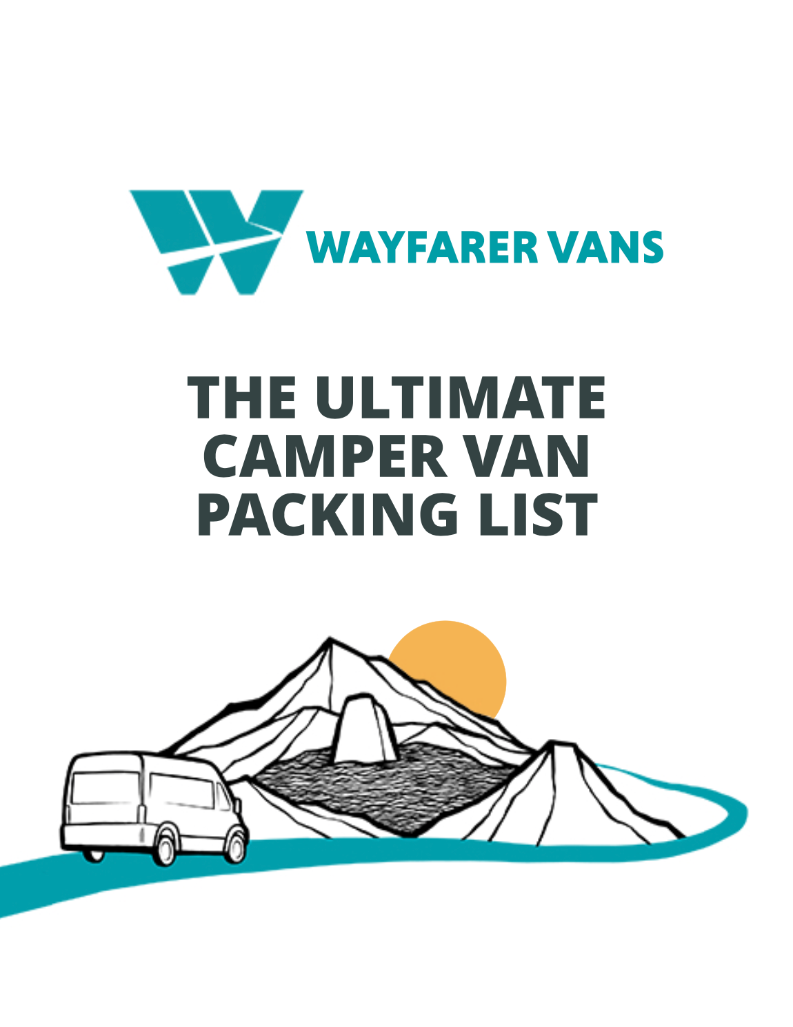
THE ULTIMATE CAMPER VAN PACKING LIST - CREATIVE REFRESH
Above is the original, which I was tasked with breathing new life into.
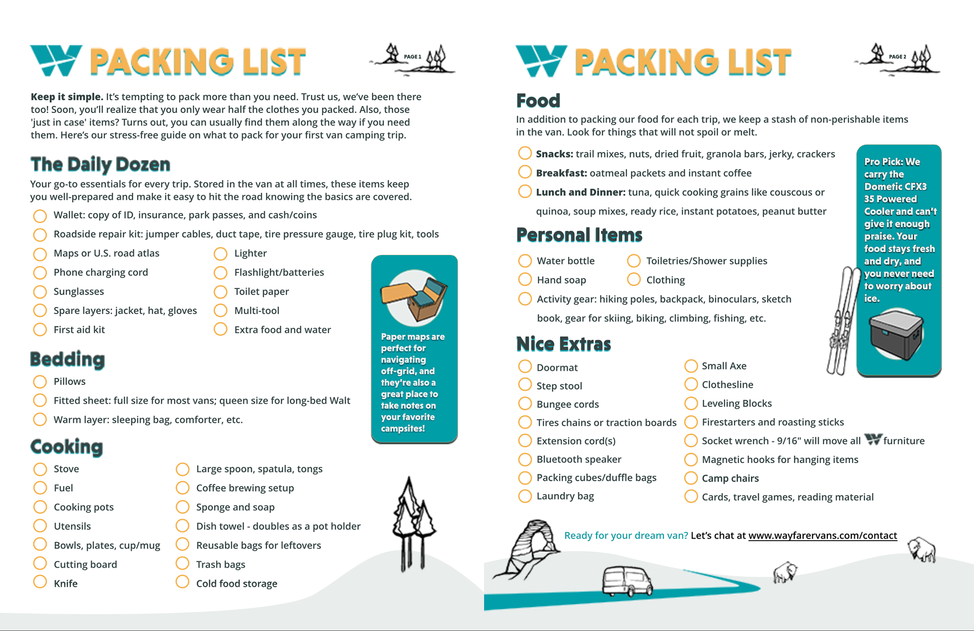
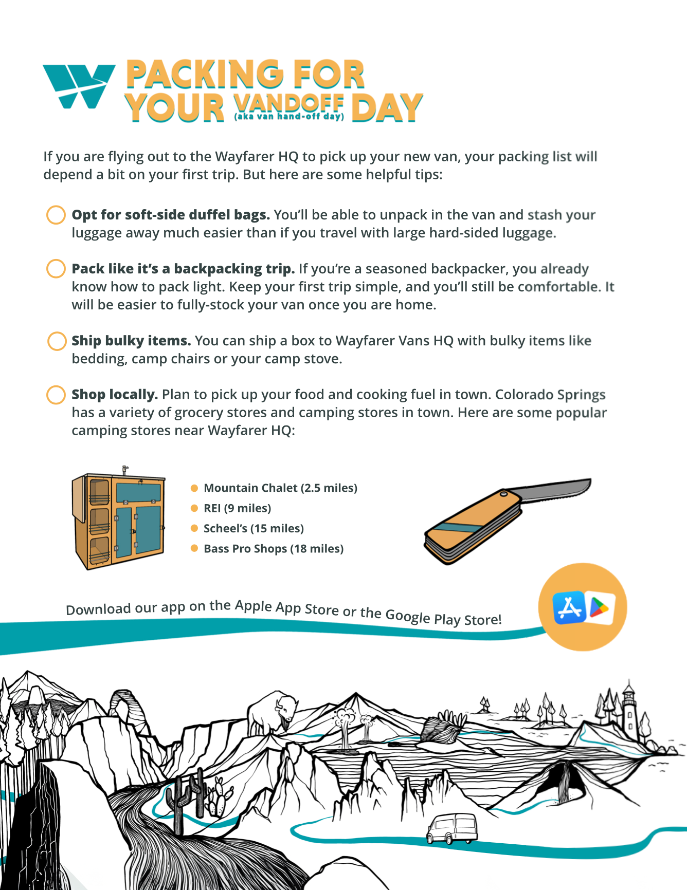
Above is my finished product.
EVENT BANNER & FLYER
EVENT FLYER
EVENT POPUP BANNER
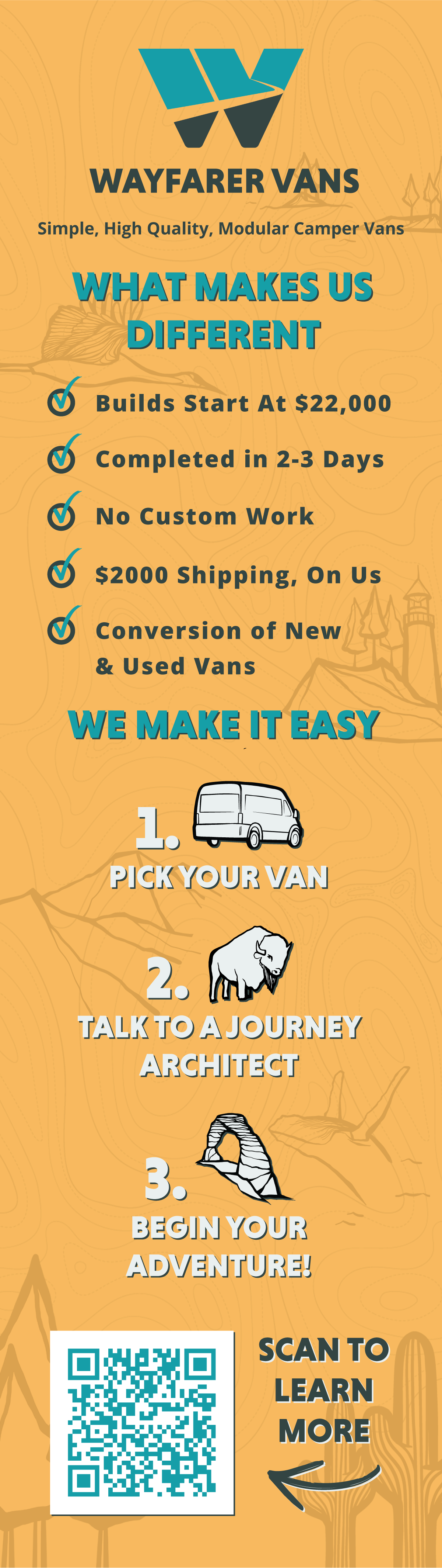
CONTENT ANALYSIS VERTICAL DECK

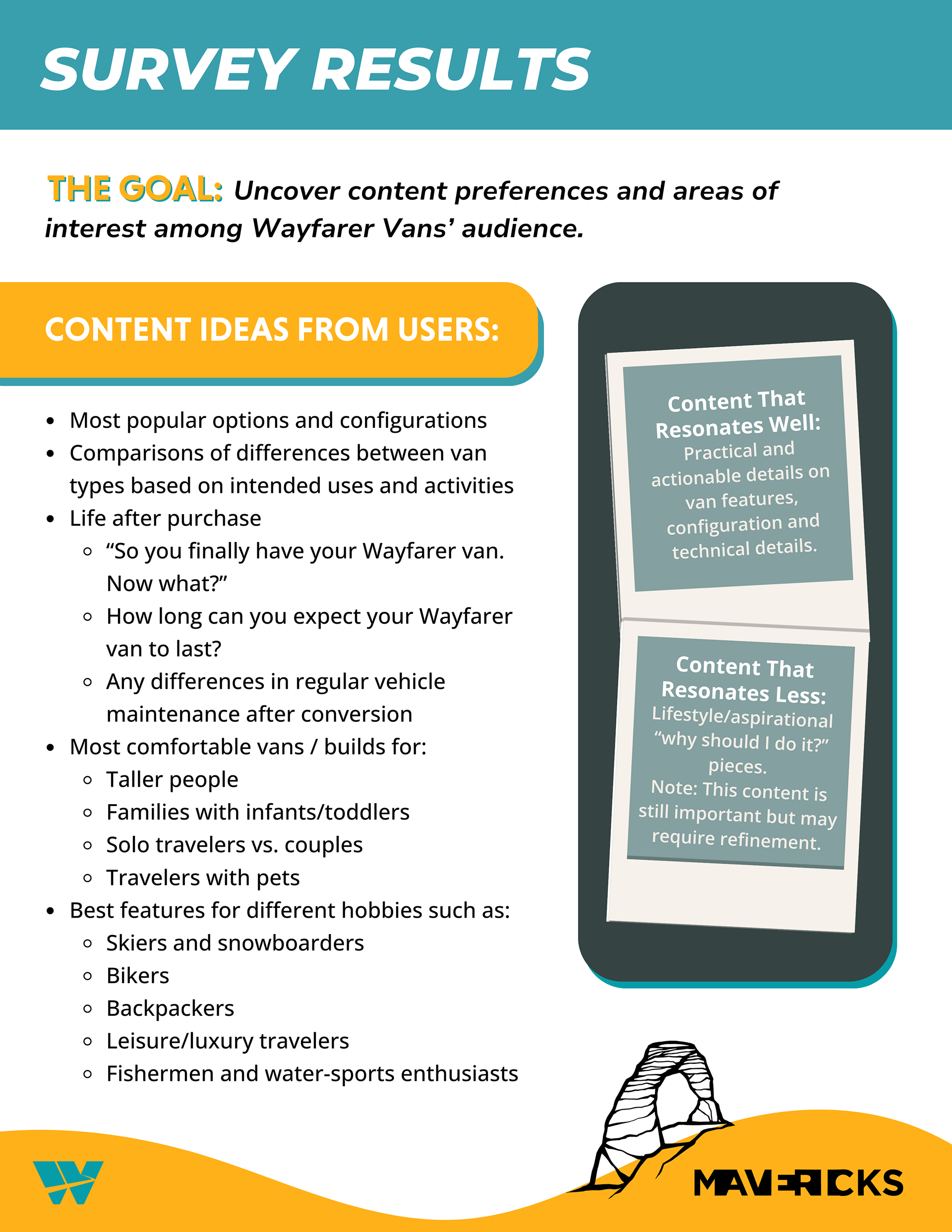
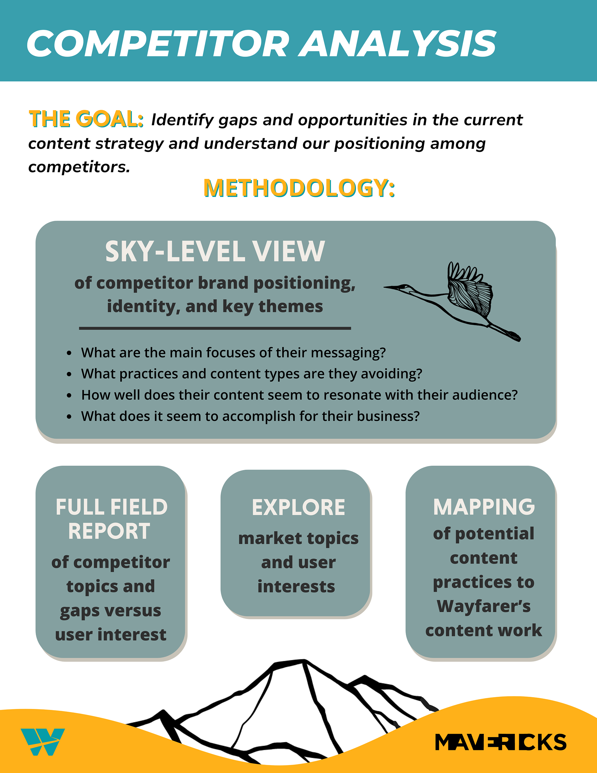
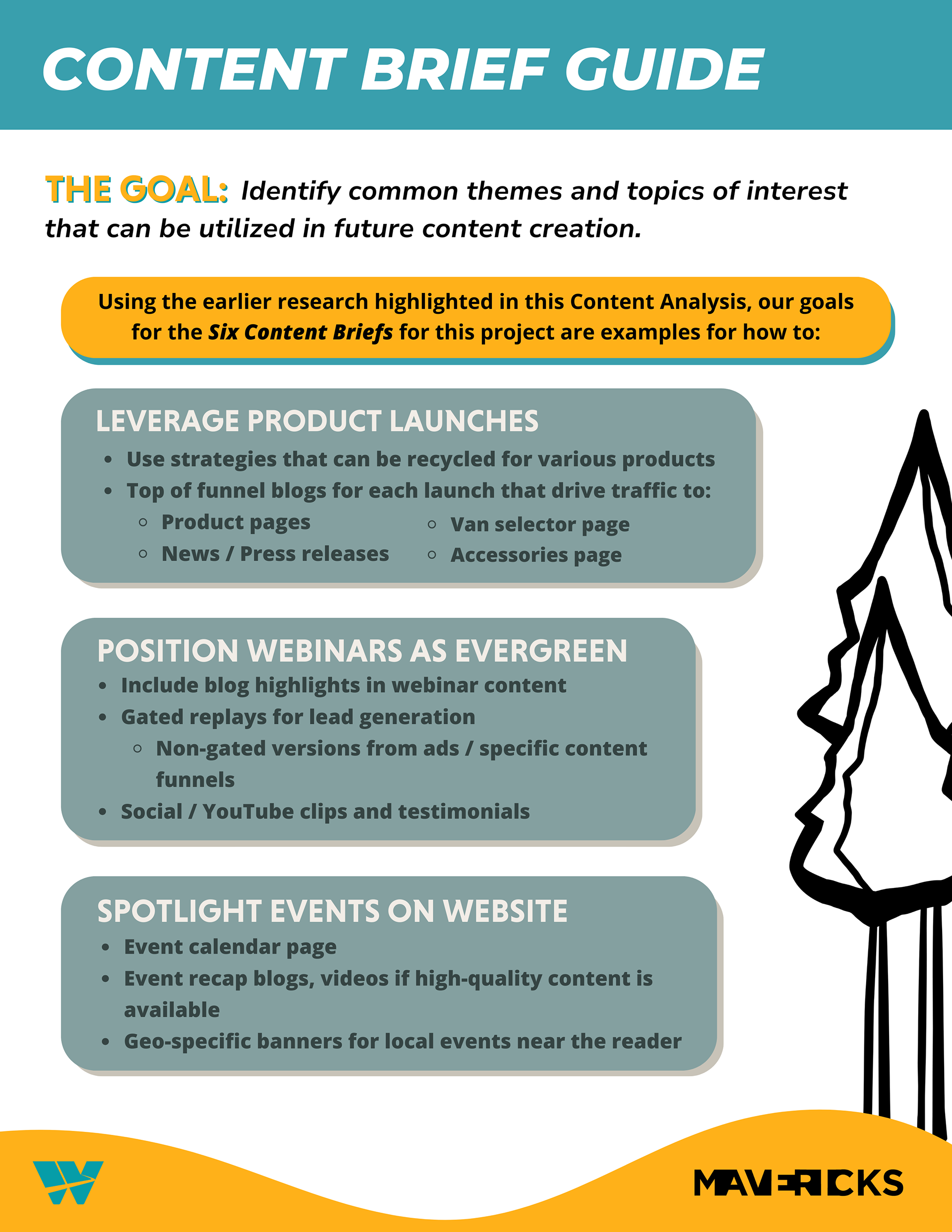
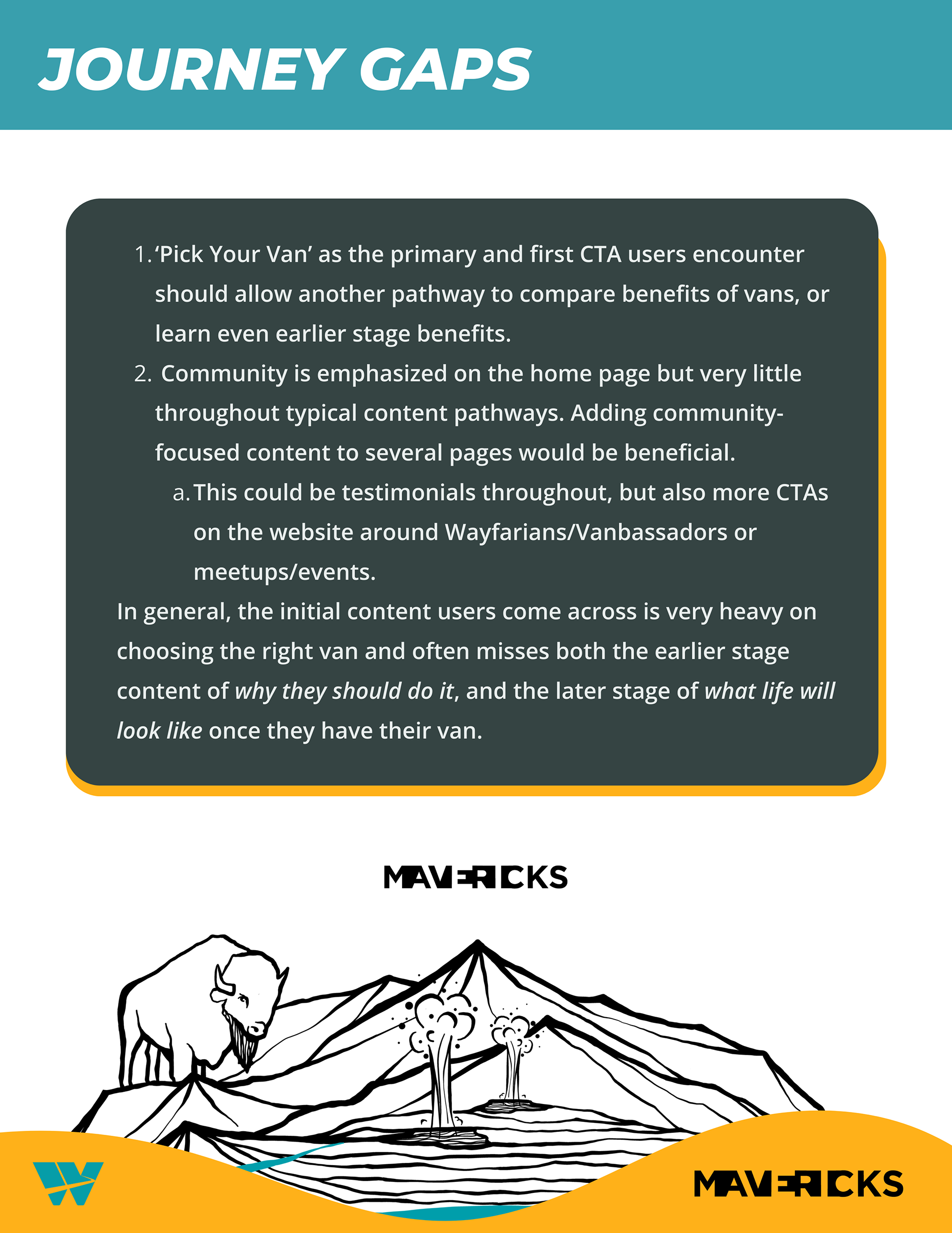
The whole document is 10+ pages long, only five of which I included here as examples.
WEB ASSETS


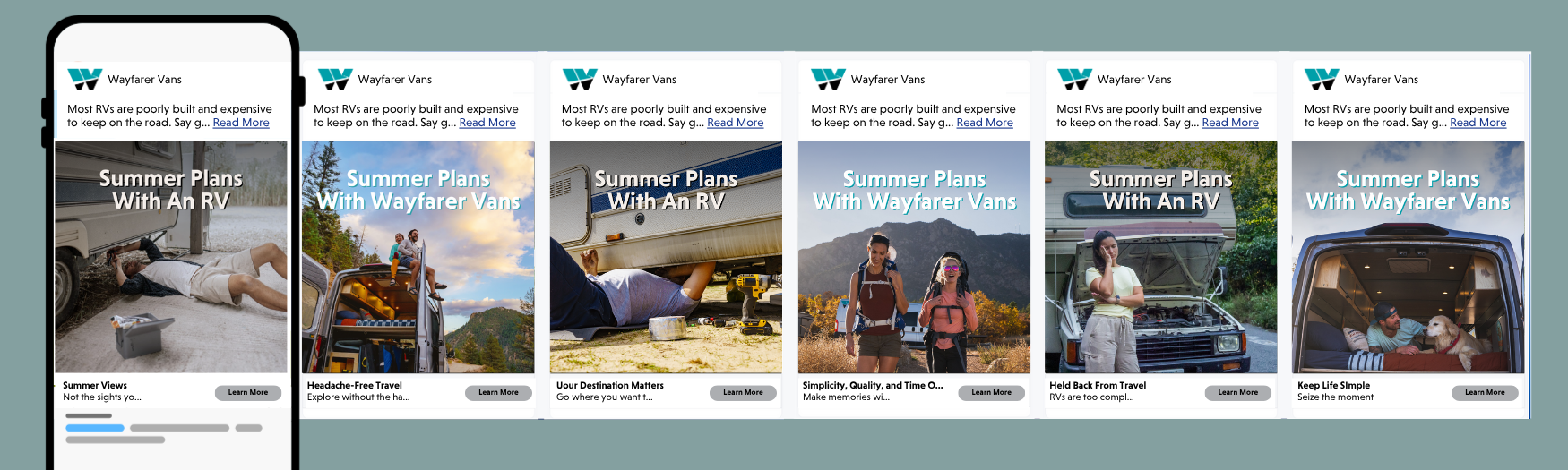
META CAROUSEL AD MOCKUP